INDUSTRY
FMCG
[ALCOHOLIC BEVERAGE]
Services
VISUAL IDENTITY
PACKAGING
Credits
CHRIS McCONVILLE [photography]
Kai Higham [animation/3d]
JimmyRum approached us with a brand name, a primary logo, and a launch date. Four product SKU’s almost ready for market, no packaging in place, and no marketing material to speak of.
The challenge wasn't just to design a label. It was to build a complete visual world around a premium spirit, in a category Australia hadn't yet taken seriously. The brand needed to look the part standalone, across the initial launch products from day one, and have the flexibility to grow into visually defined product tiers, collaborations and limited-edition releases in the future.
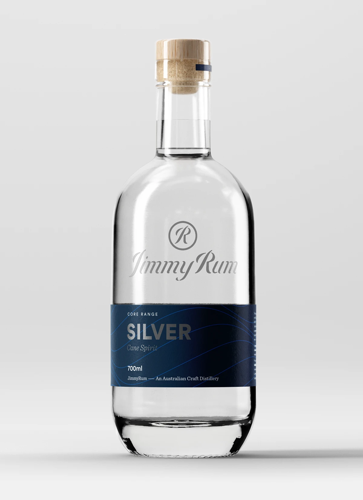
SILVER
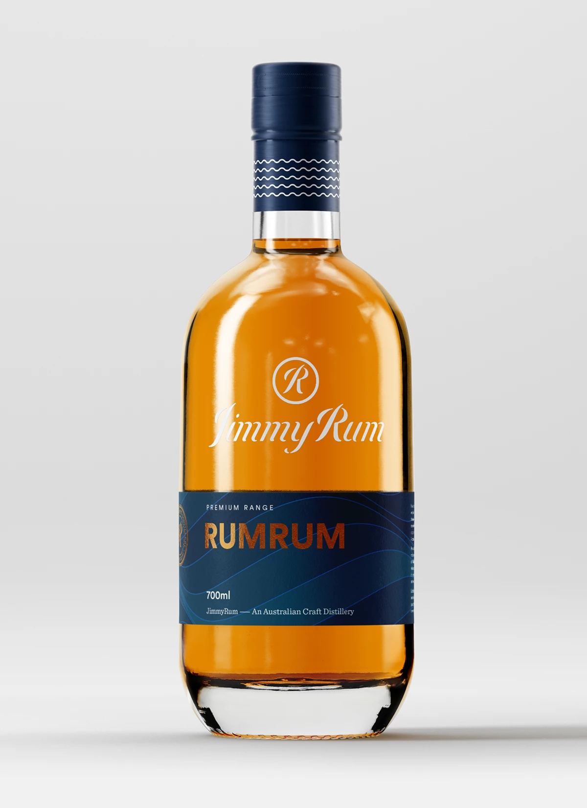
RUM RUM
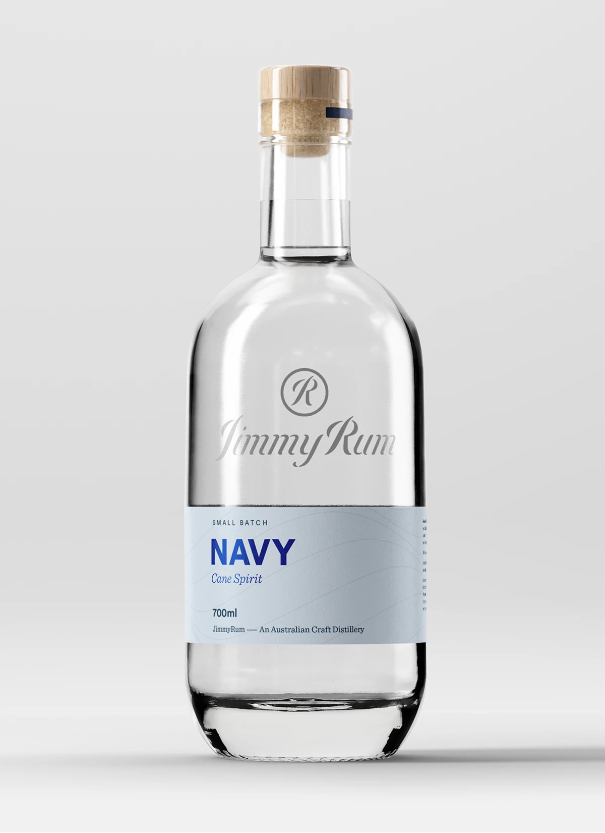
NAVY
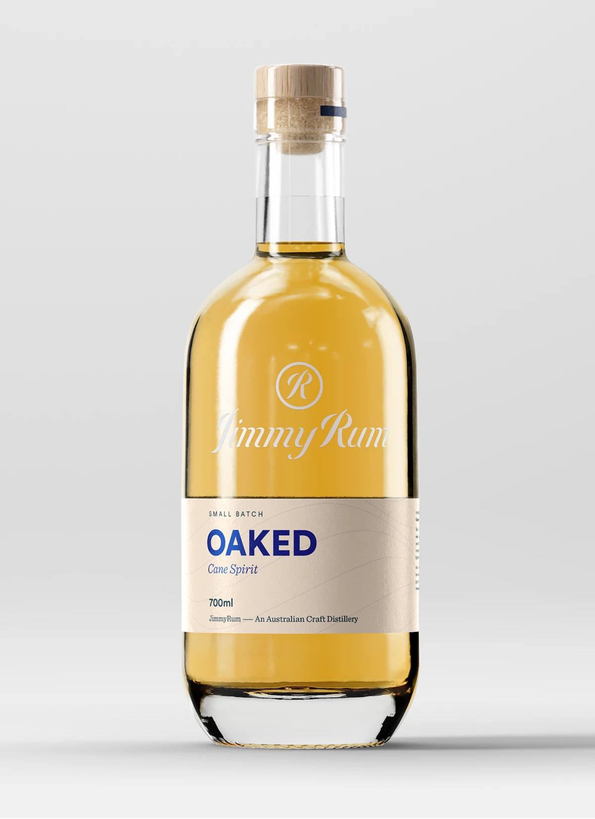
OAKED
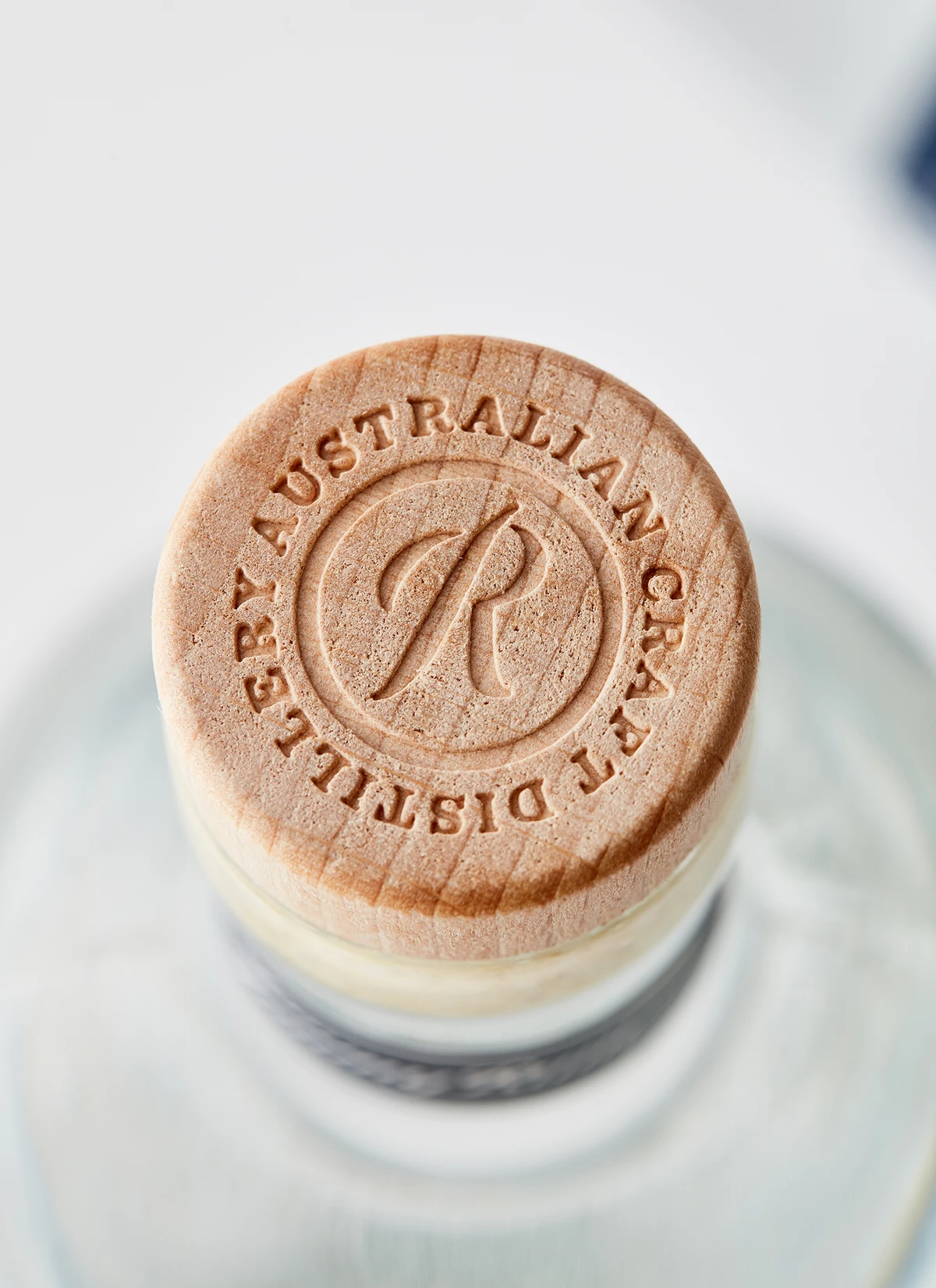
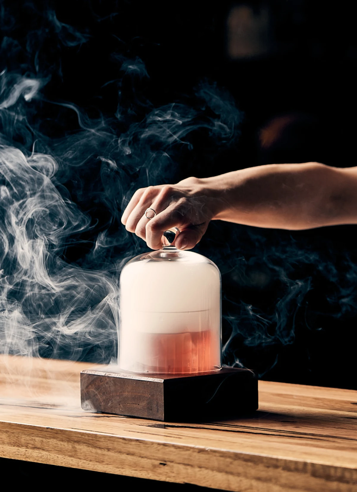
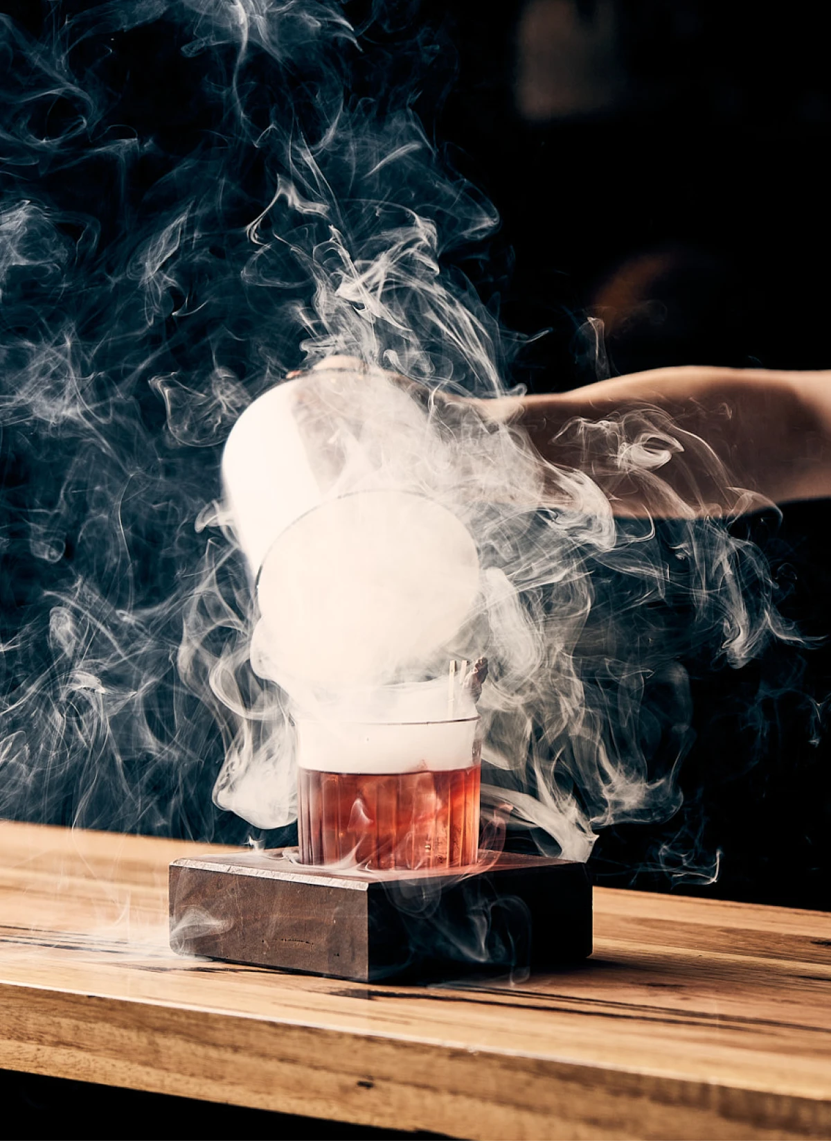
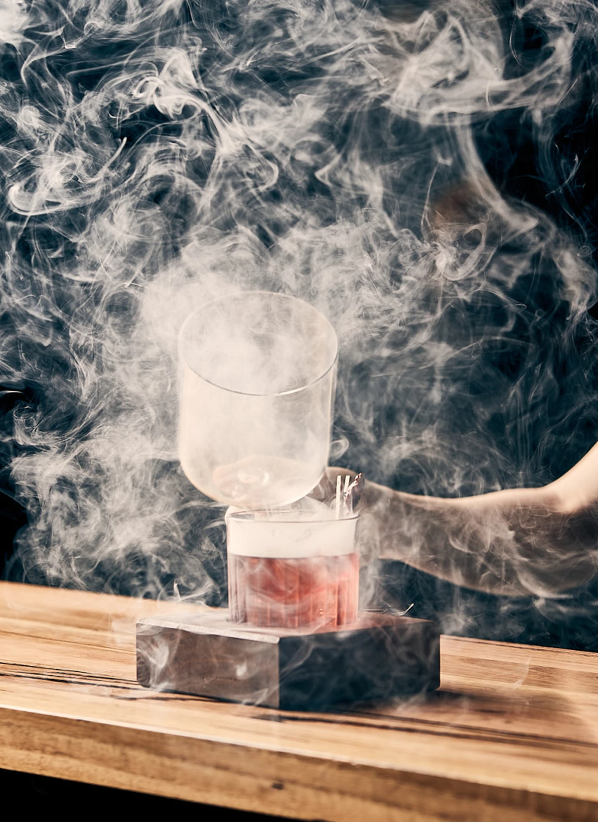
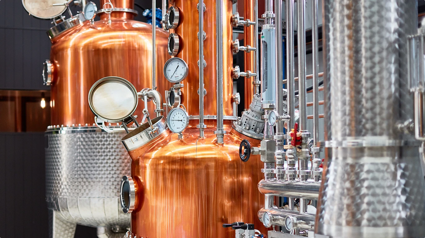
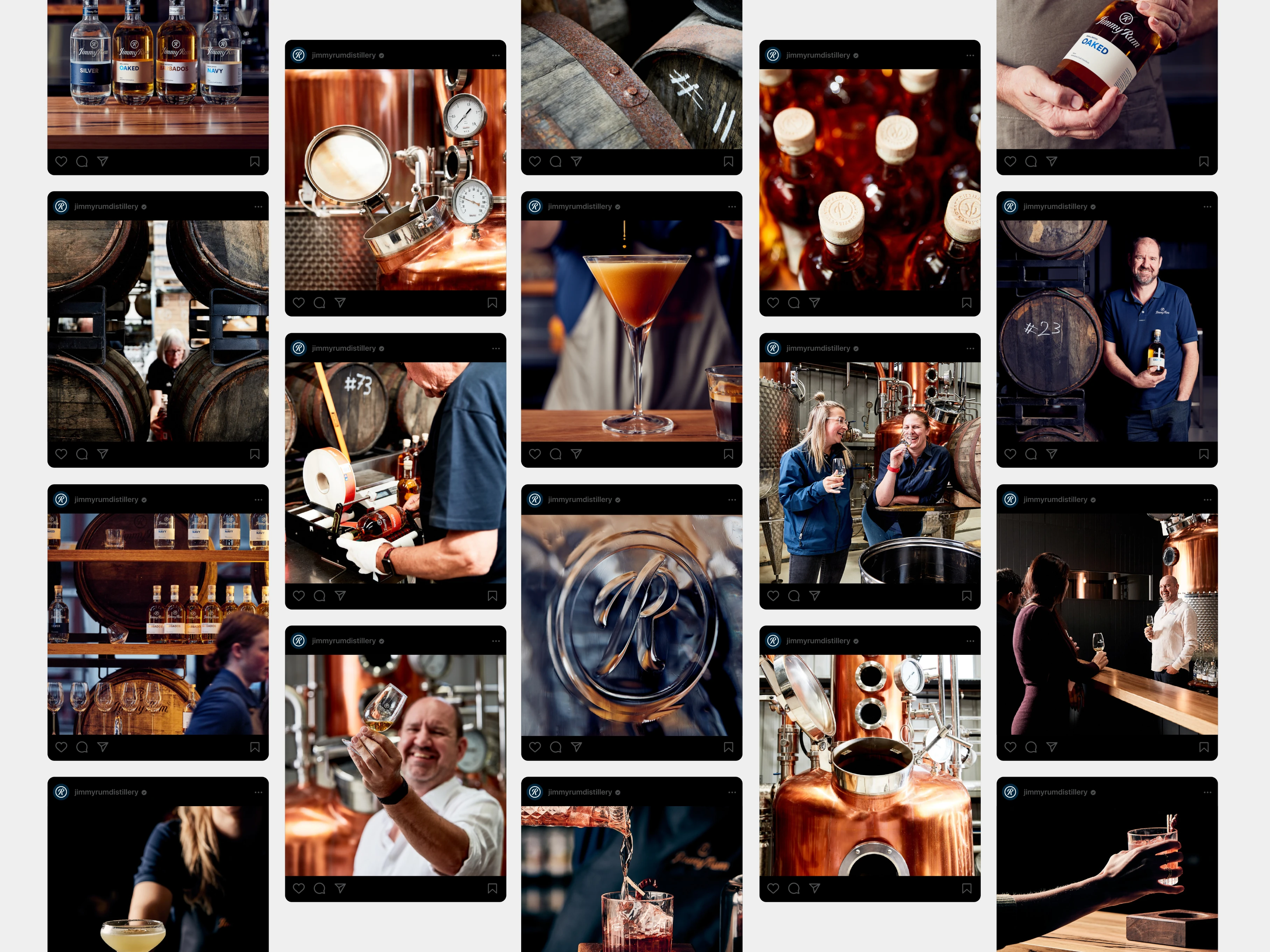
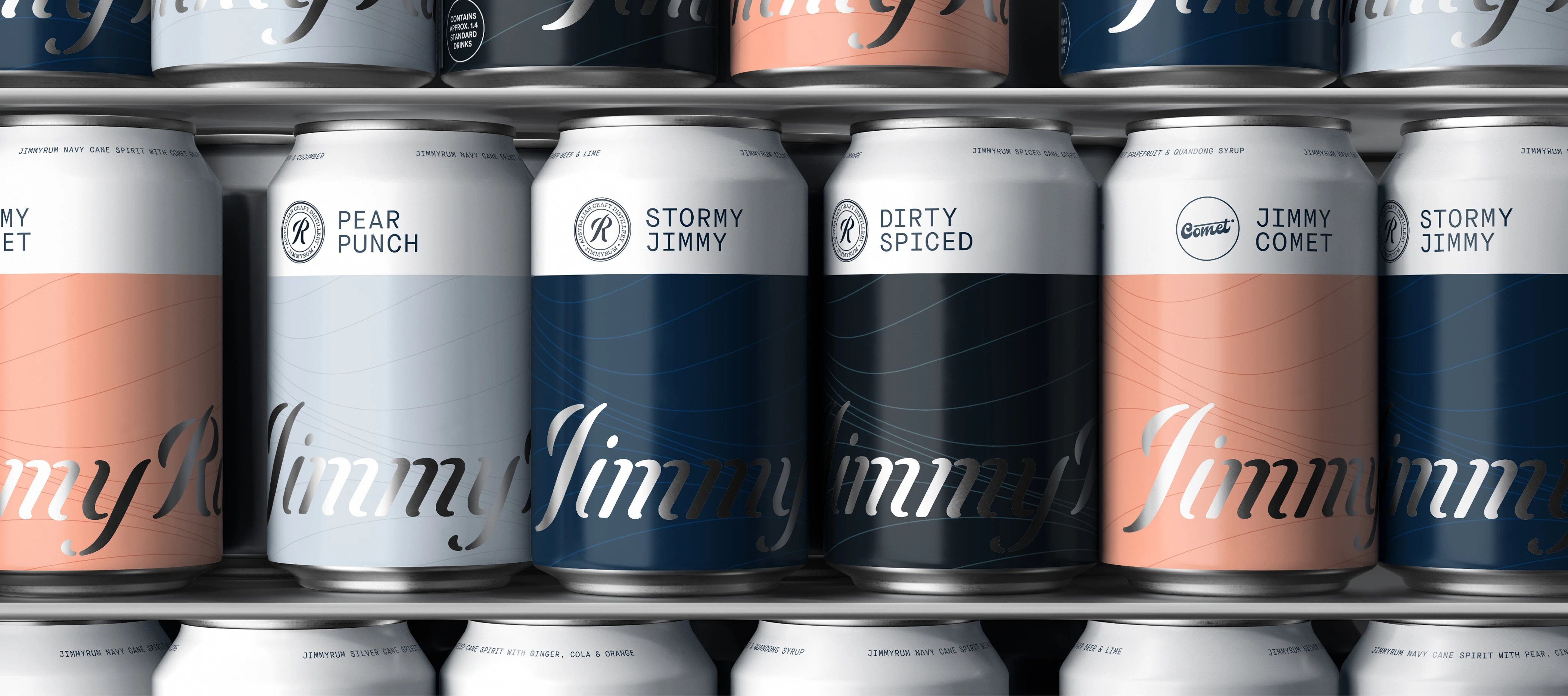
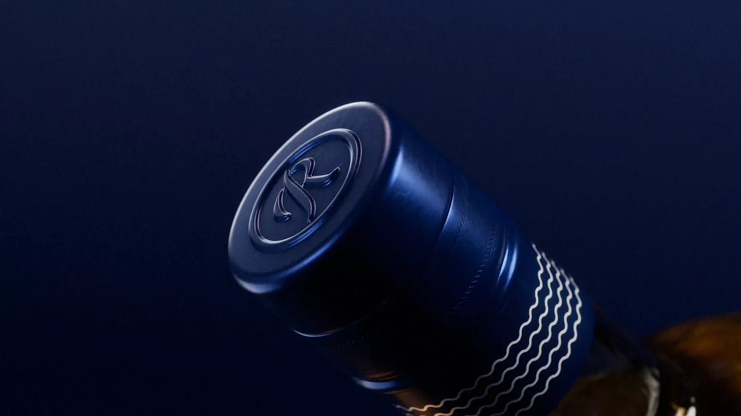
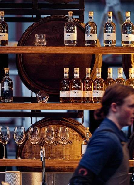
We built the entire JimmyRum visual system from the ground up. Packaging was designed across all four launch products, with a clear visual hierarchy that gave each expression its own identity while keeping the range unified.
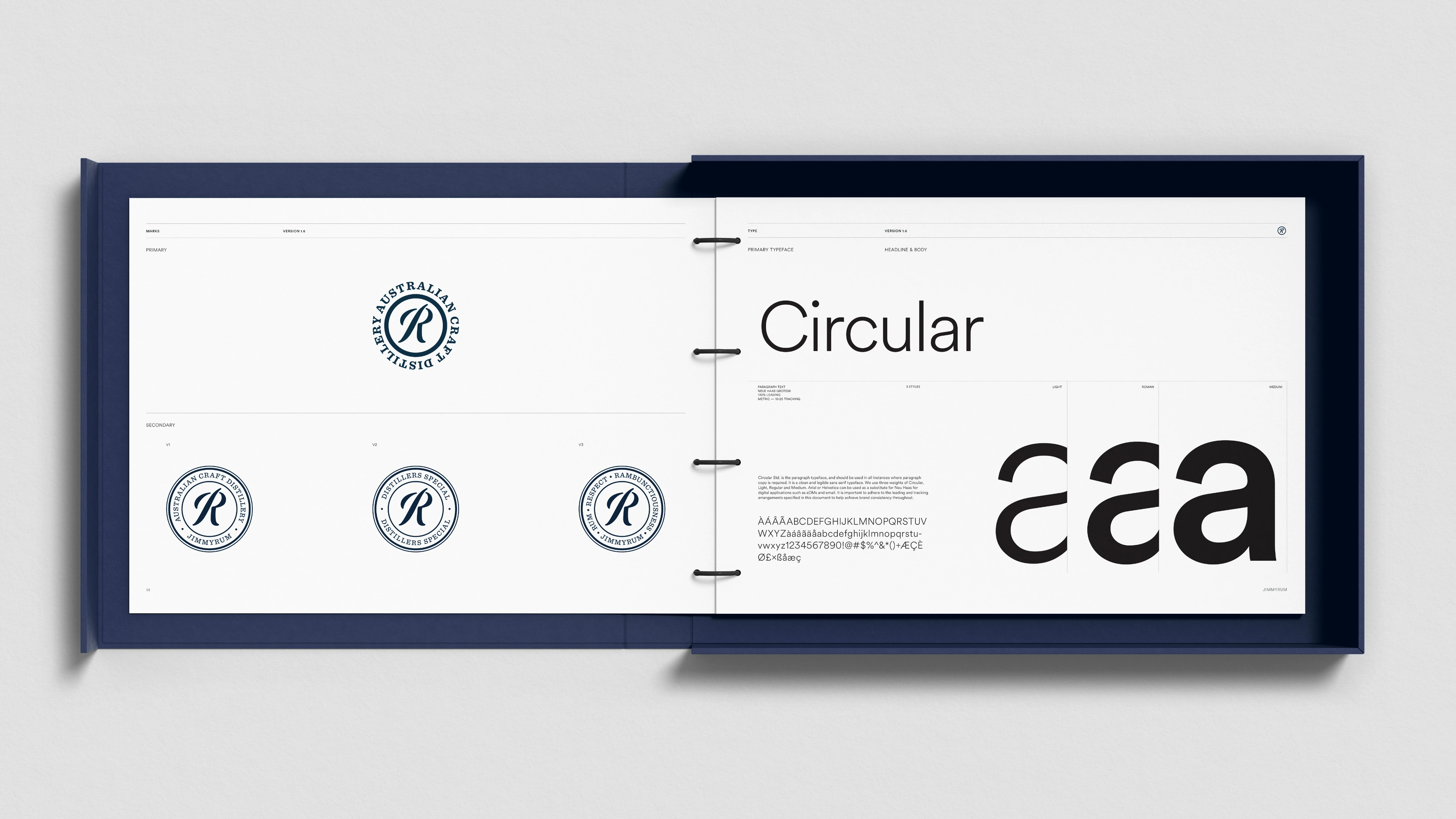
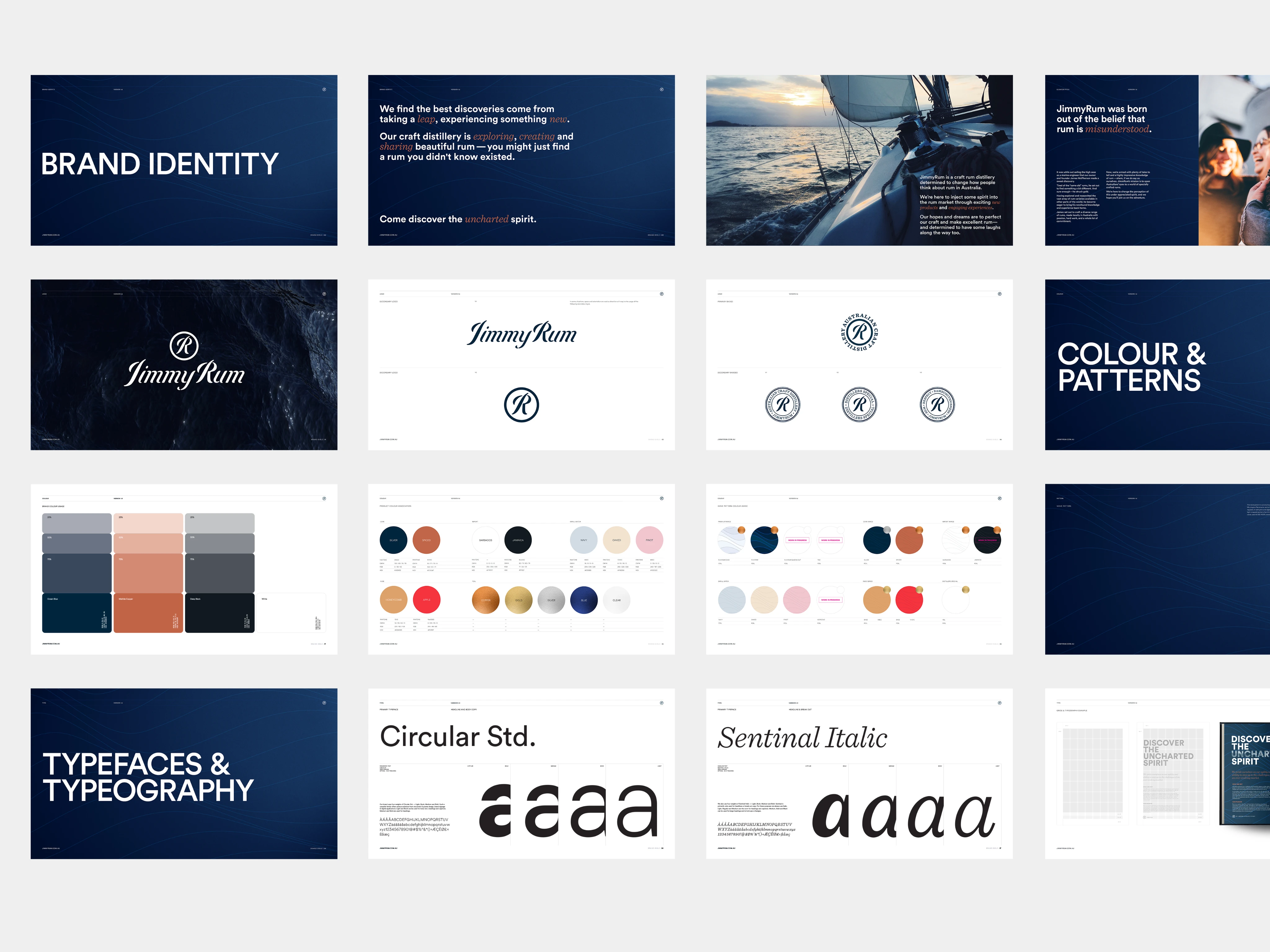
Brand guidelines, social templates, and print collateral followed, all built from the same design DNA. The system was structured from the outset with scalability in mind, defining visual territories for core product tiers and a framework flexible enough to accommodate limited-edition releases without ever compromising the coherence of the range.
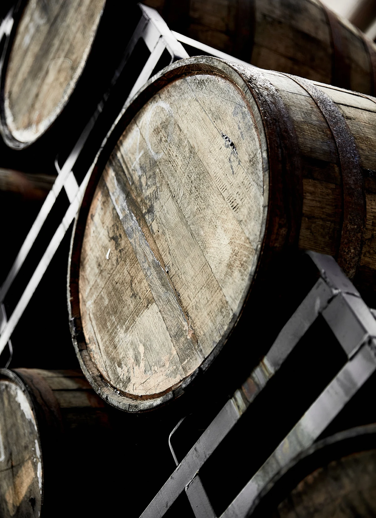
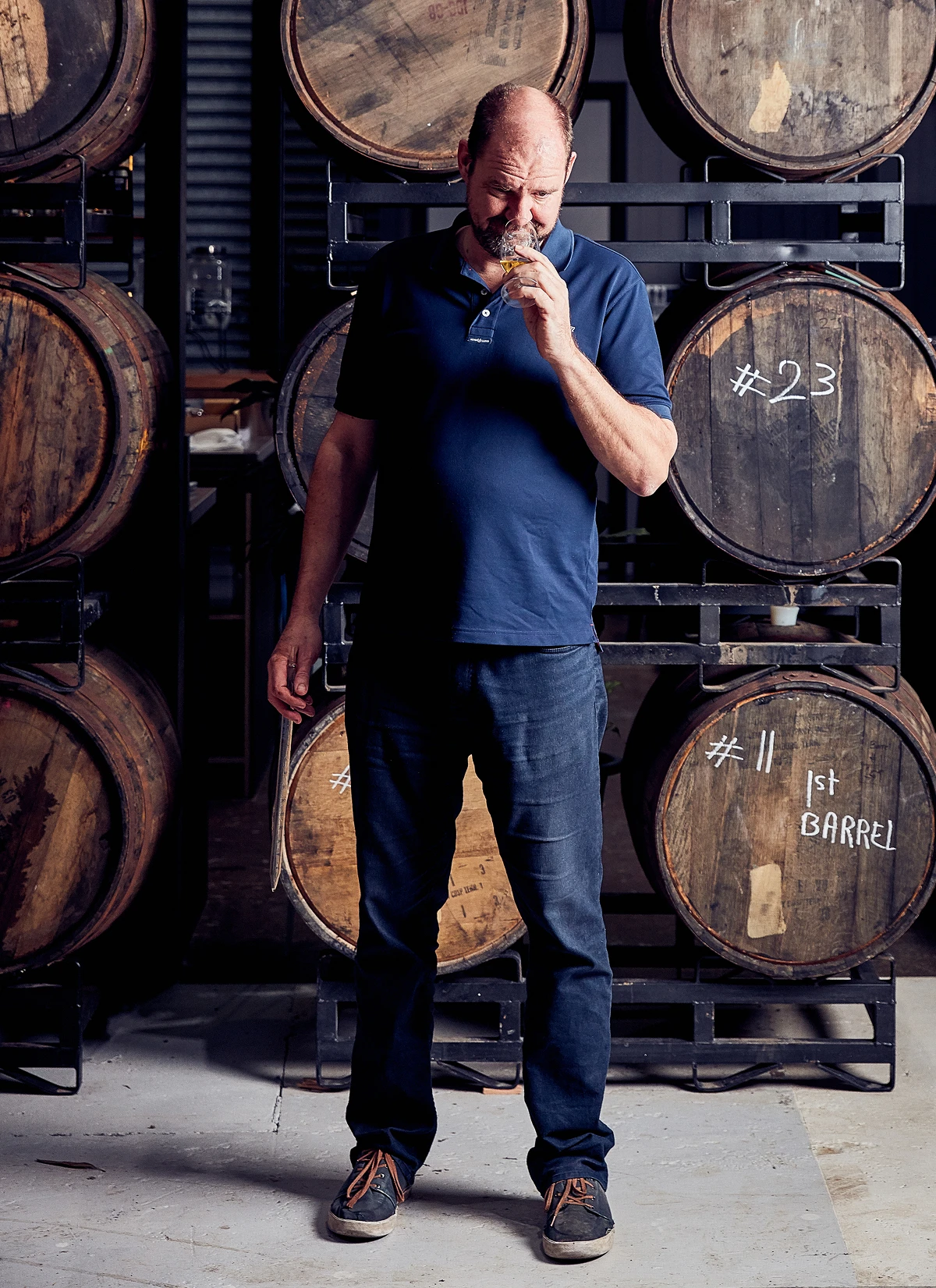
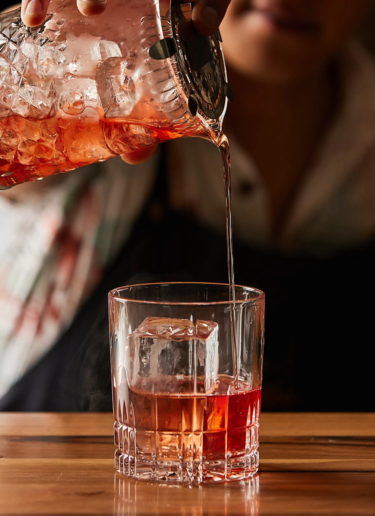
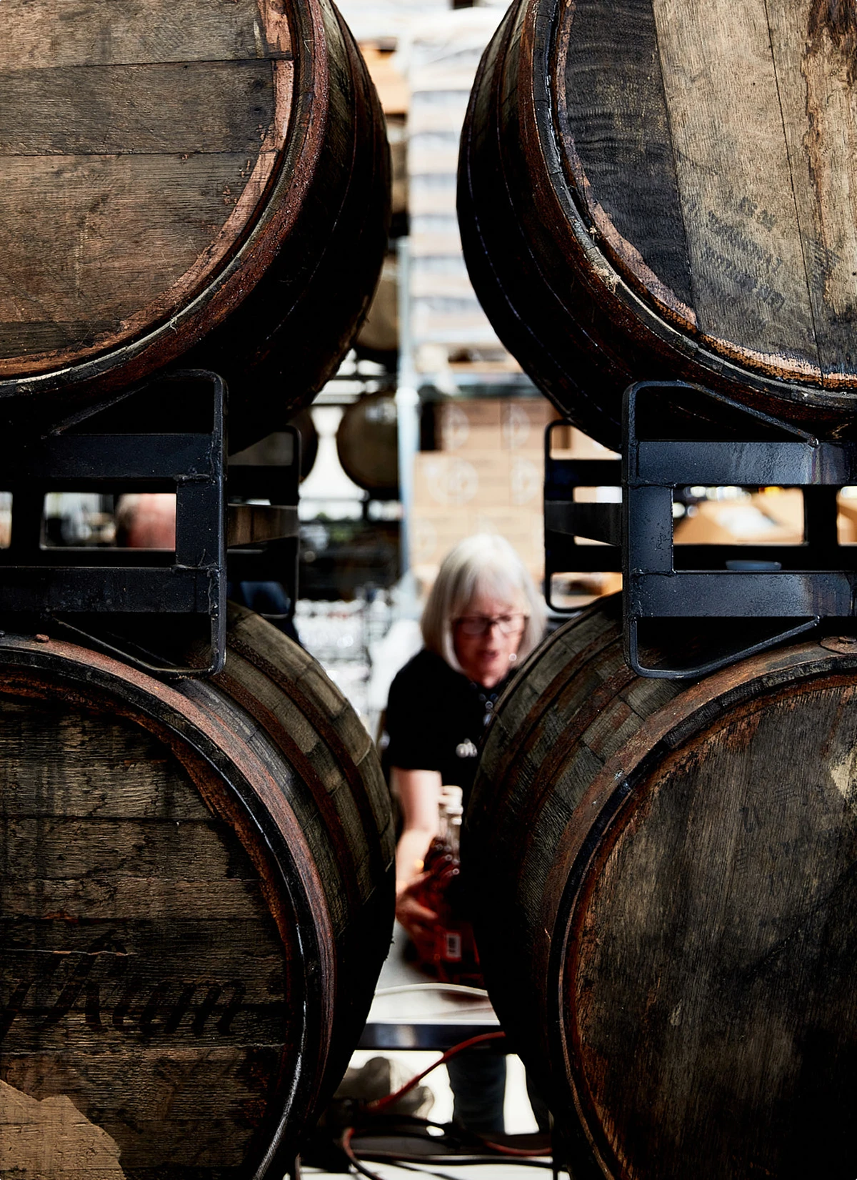
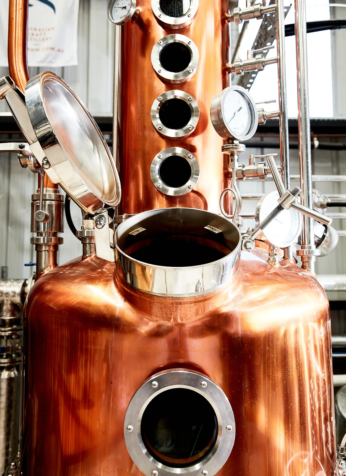
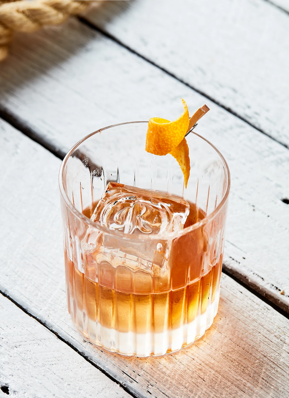
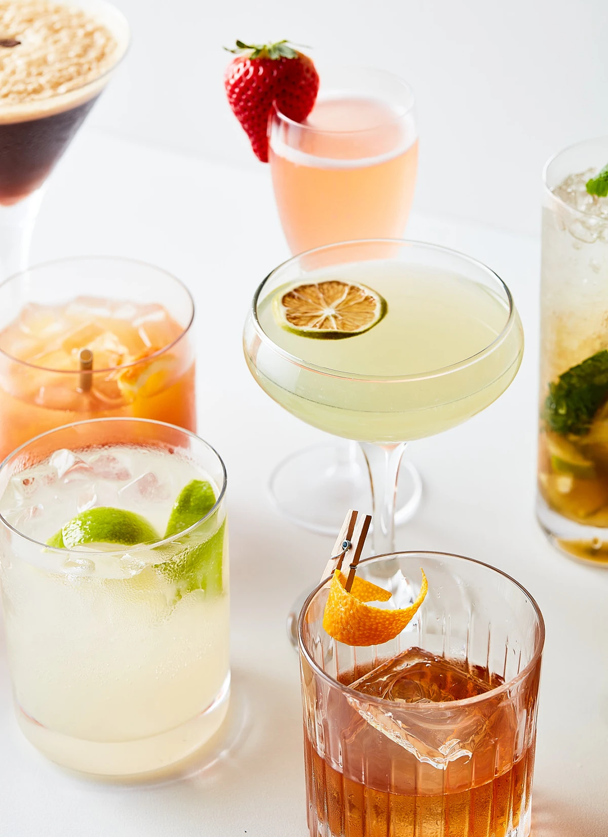
Photography was used throughout their social media with intent, shifting between light and dark depending on the season, giving the brand a living presence across the year.