INDUSTRY
building and construction
[residential]
Services
brand IDENTITY
website
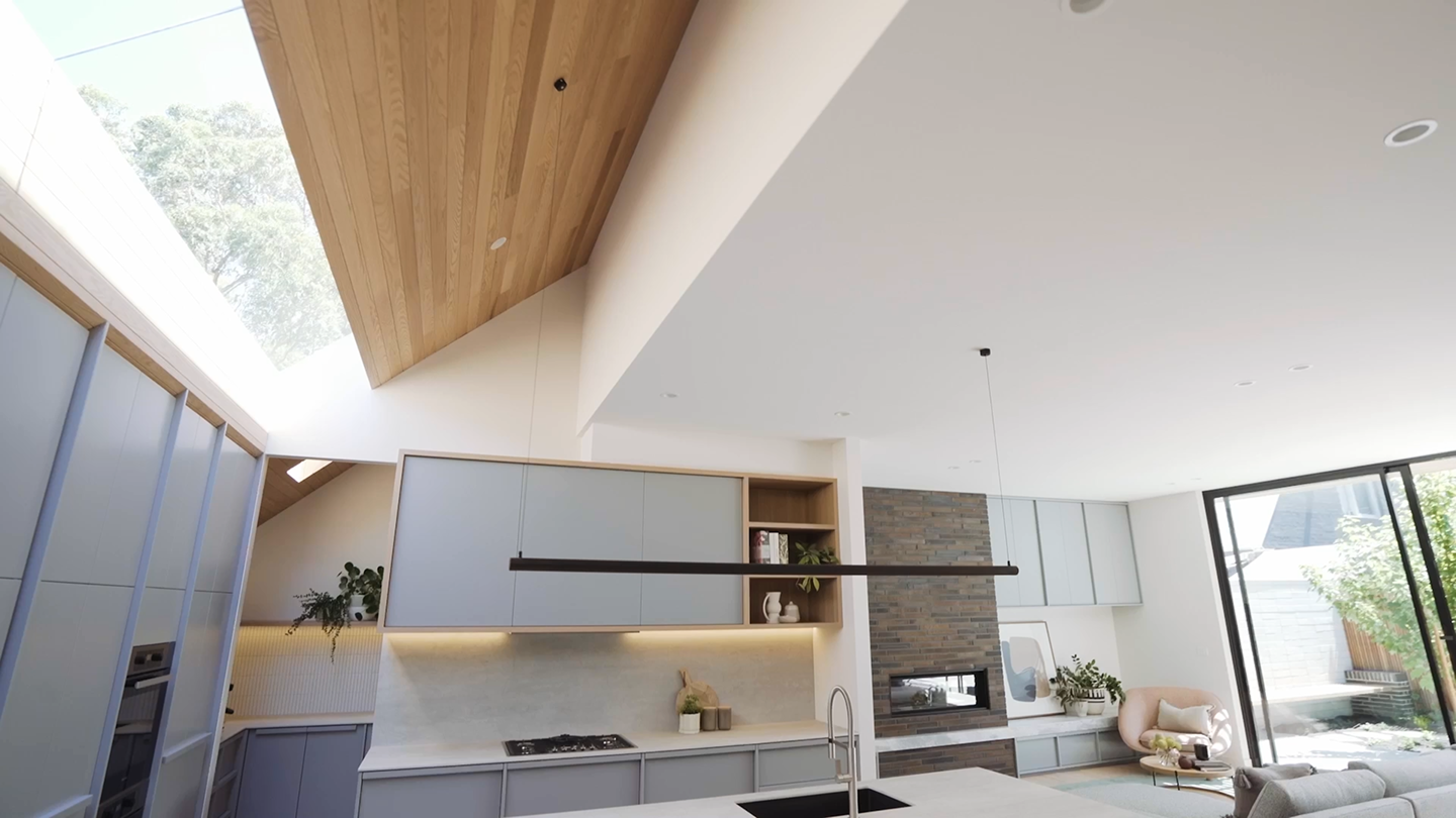
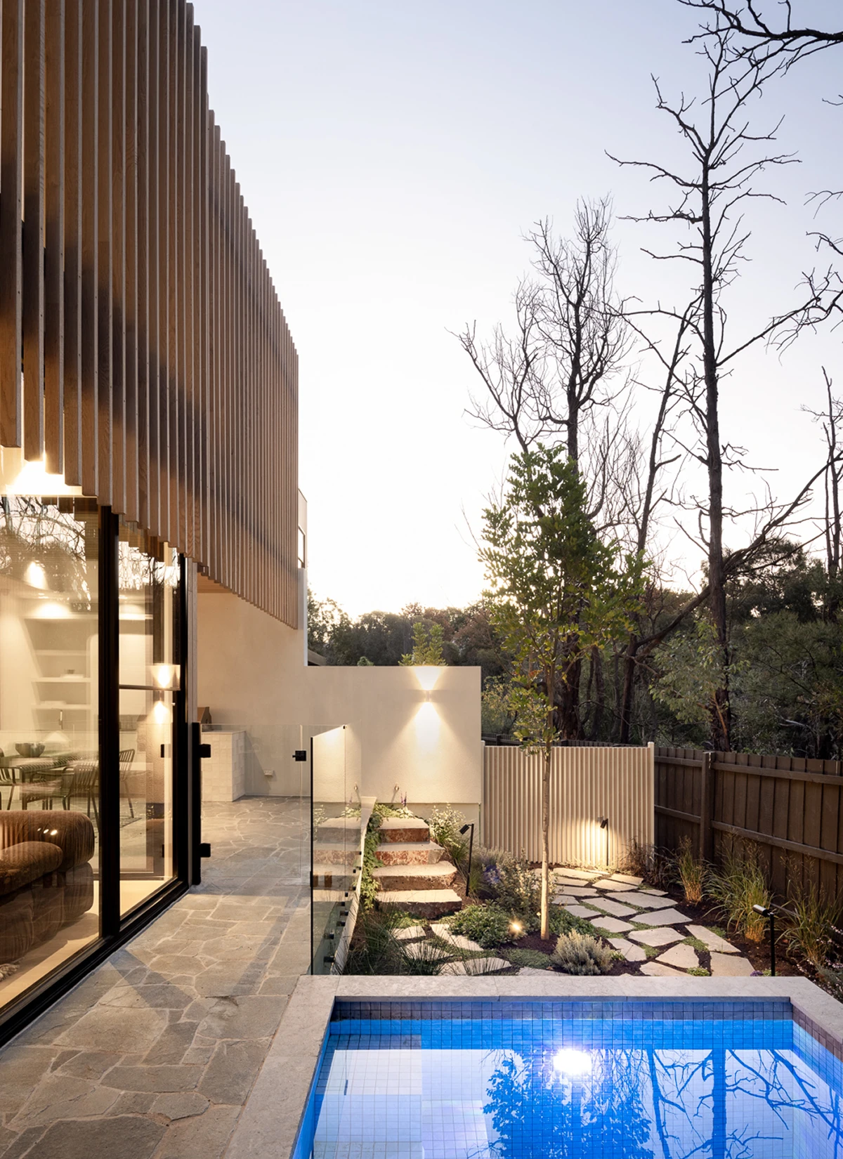
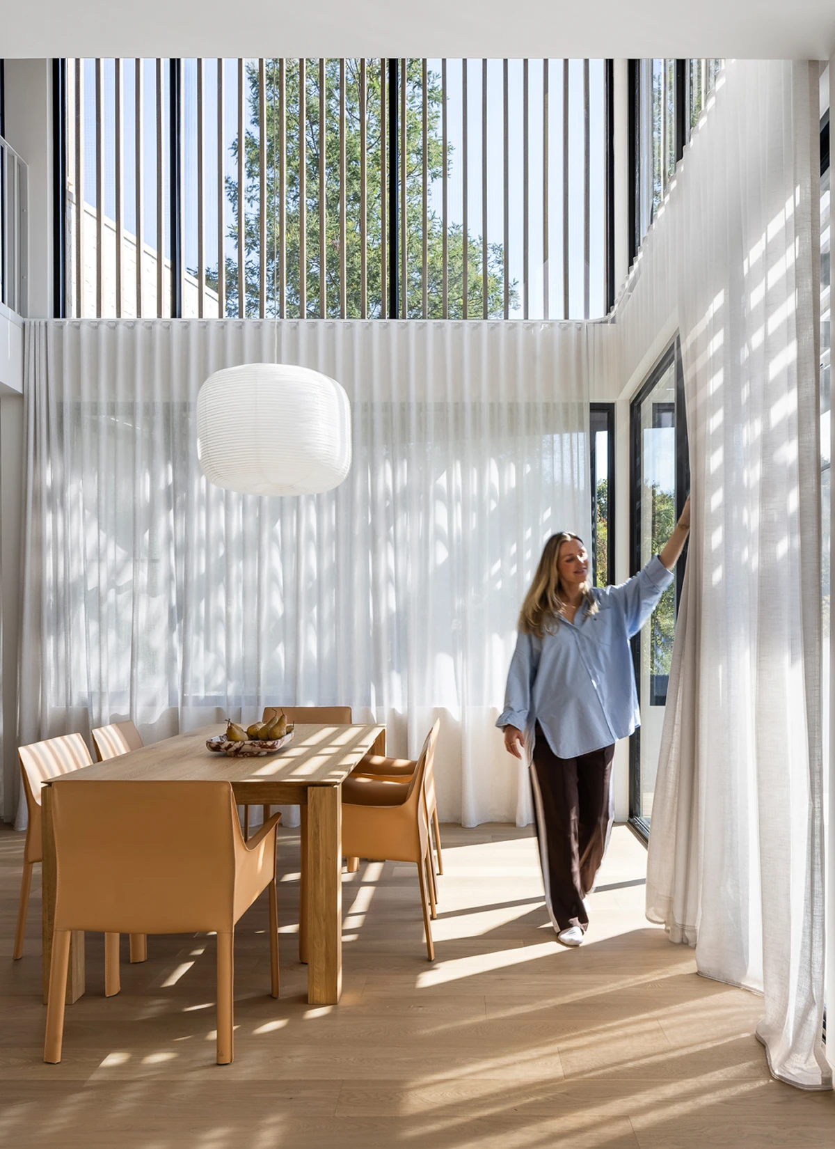
Orbis Constructions engaged us with a brand identity that gave a perception of them being a trade commercial builder, not that of a creator of design-led homes, considered and finished to an exceptional standard.
The brief was to give Orbis an identity that matched the calibre of its work. Premium enough to sit alongside the architects and designers they collaborate with yet remain simple and practical.
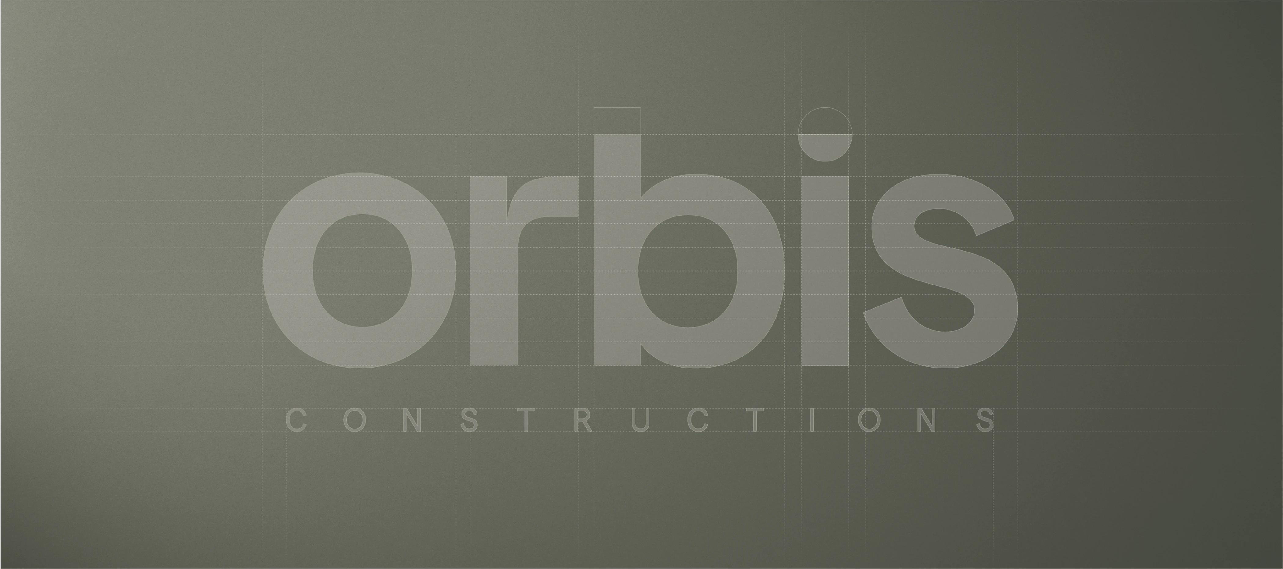
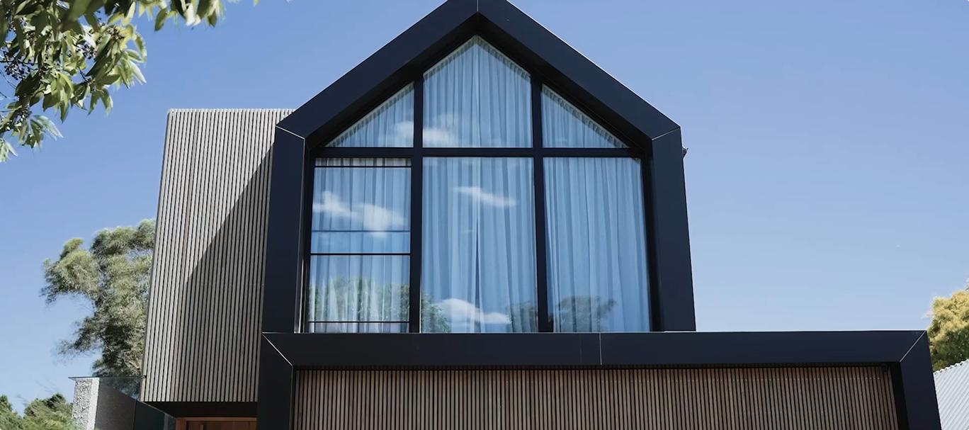
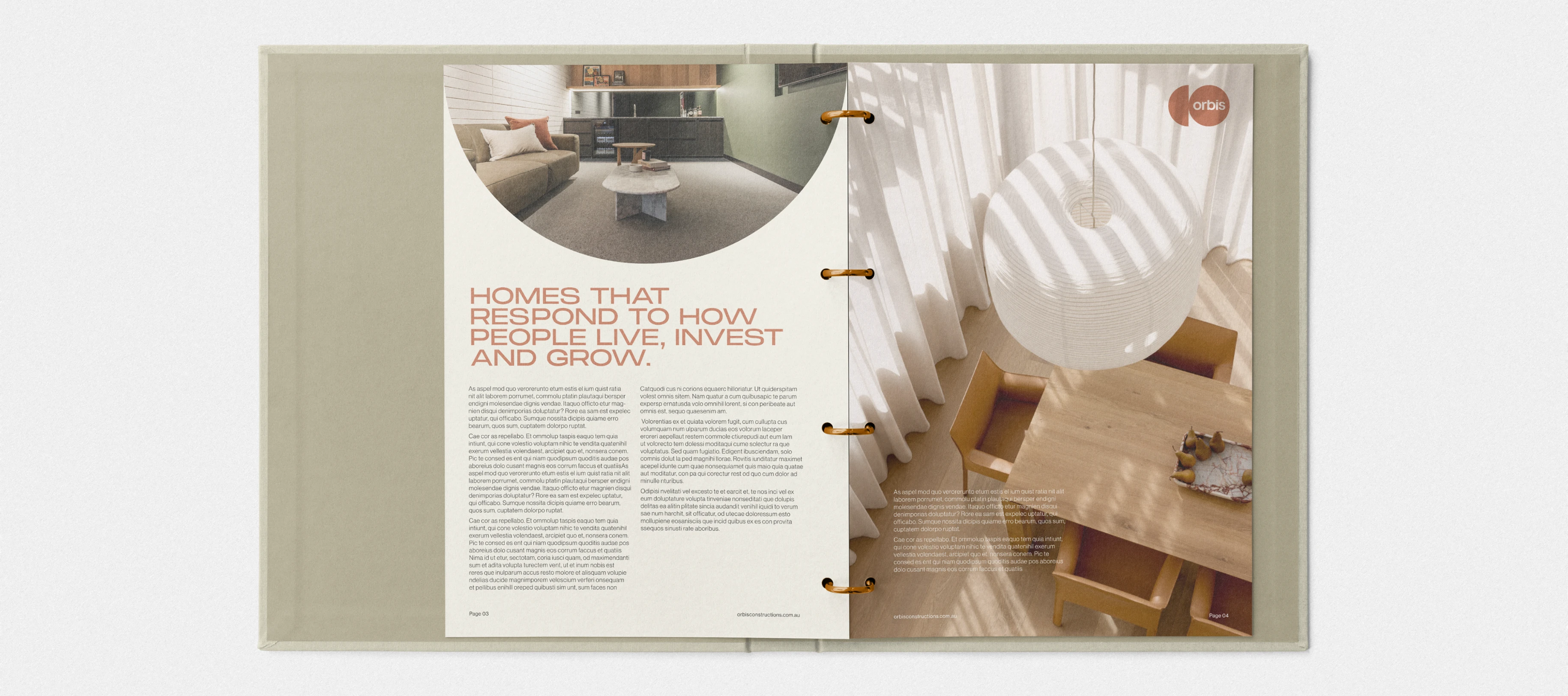
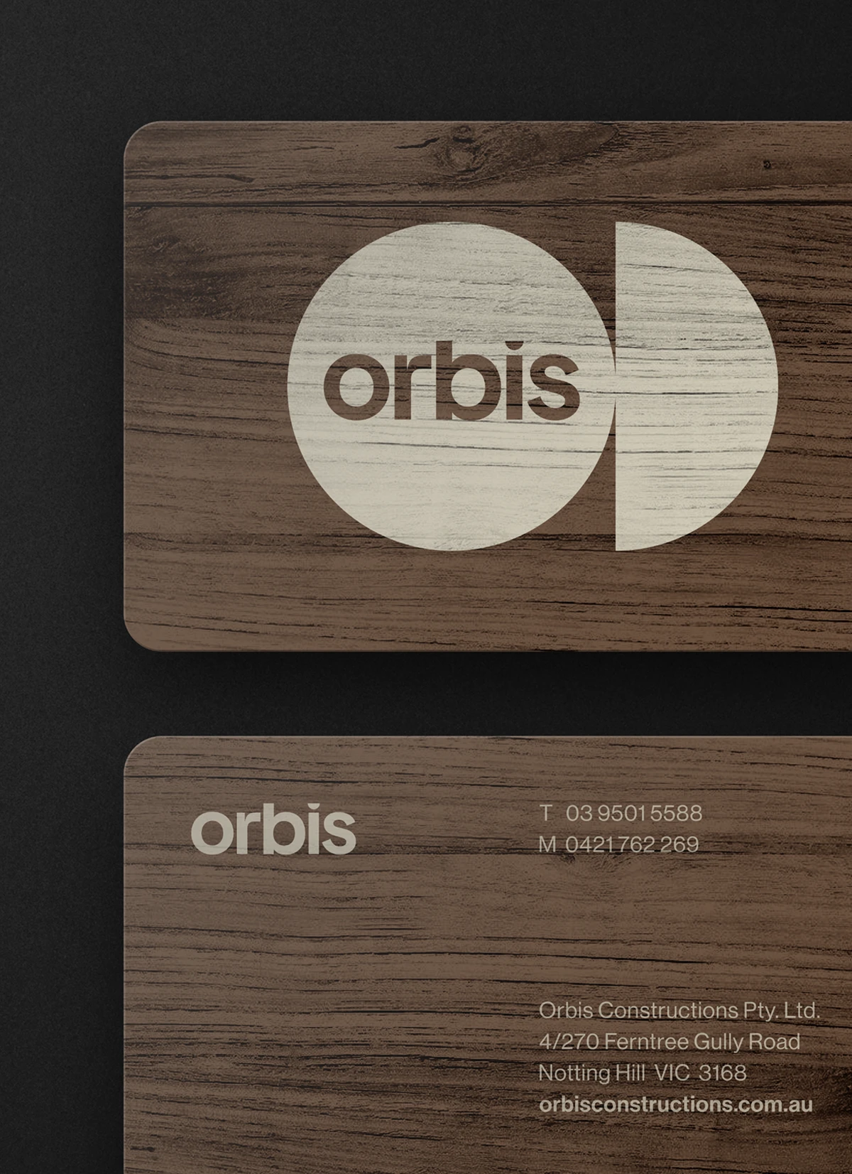
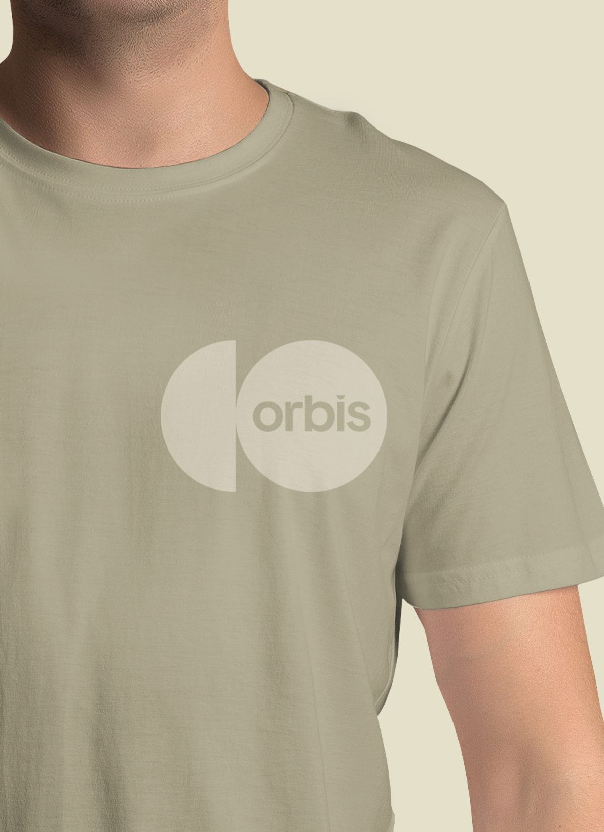
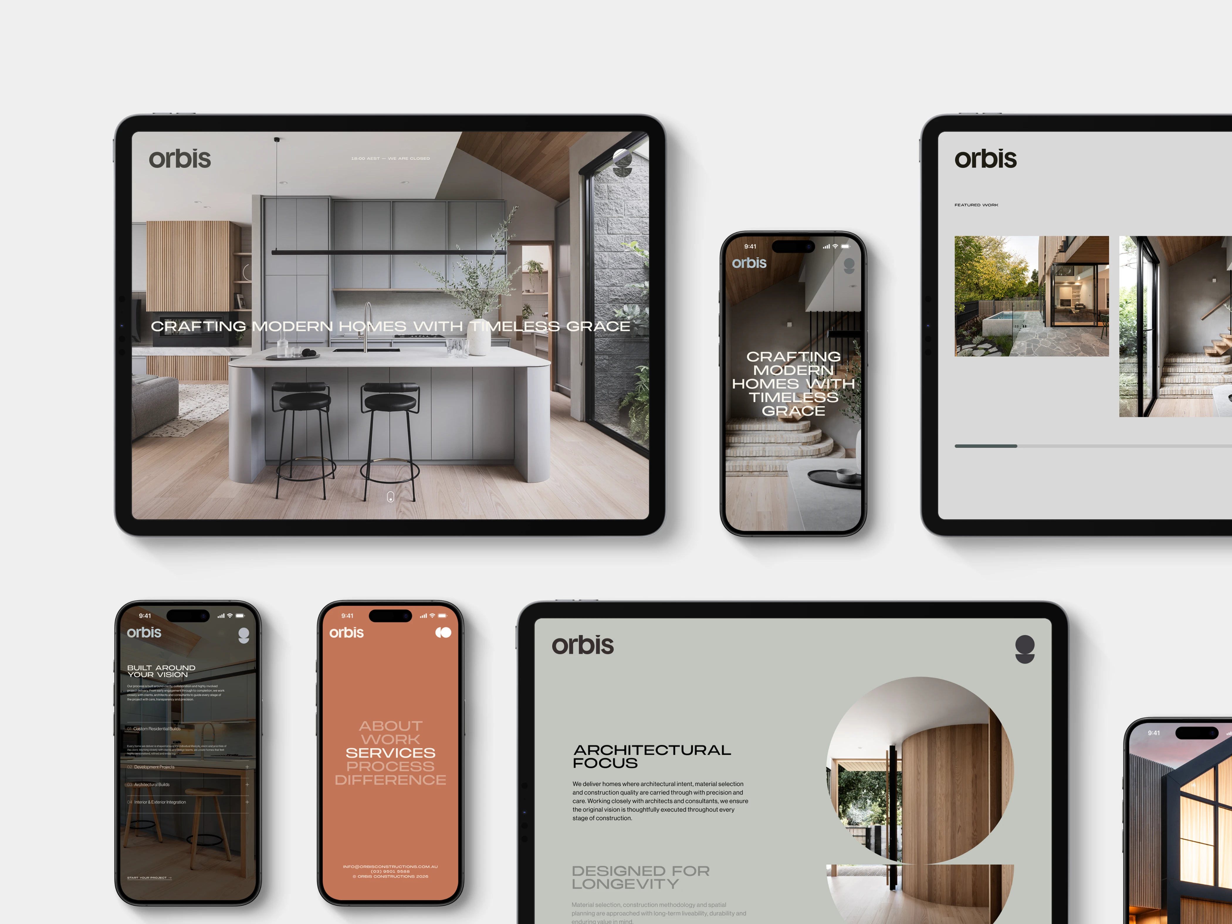
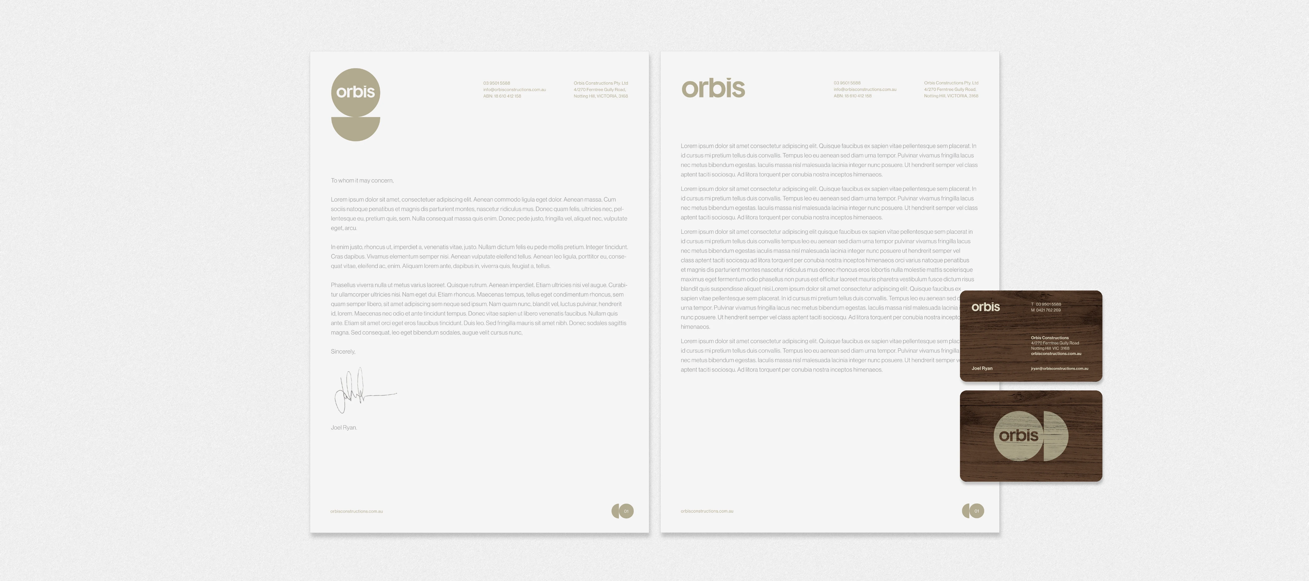
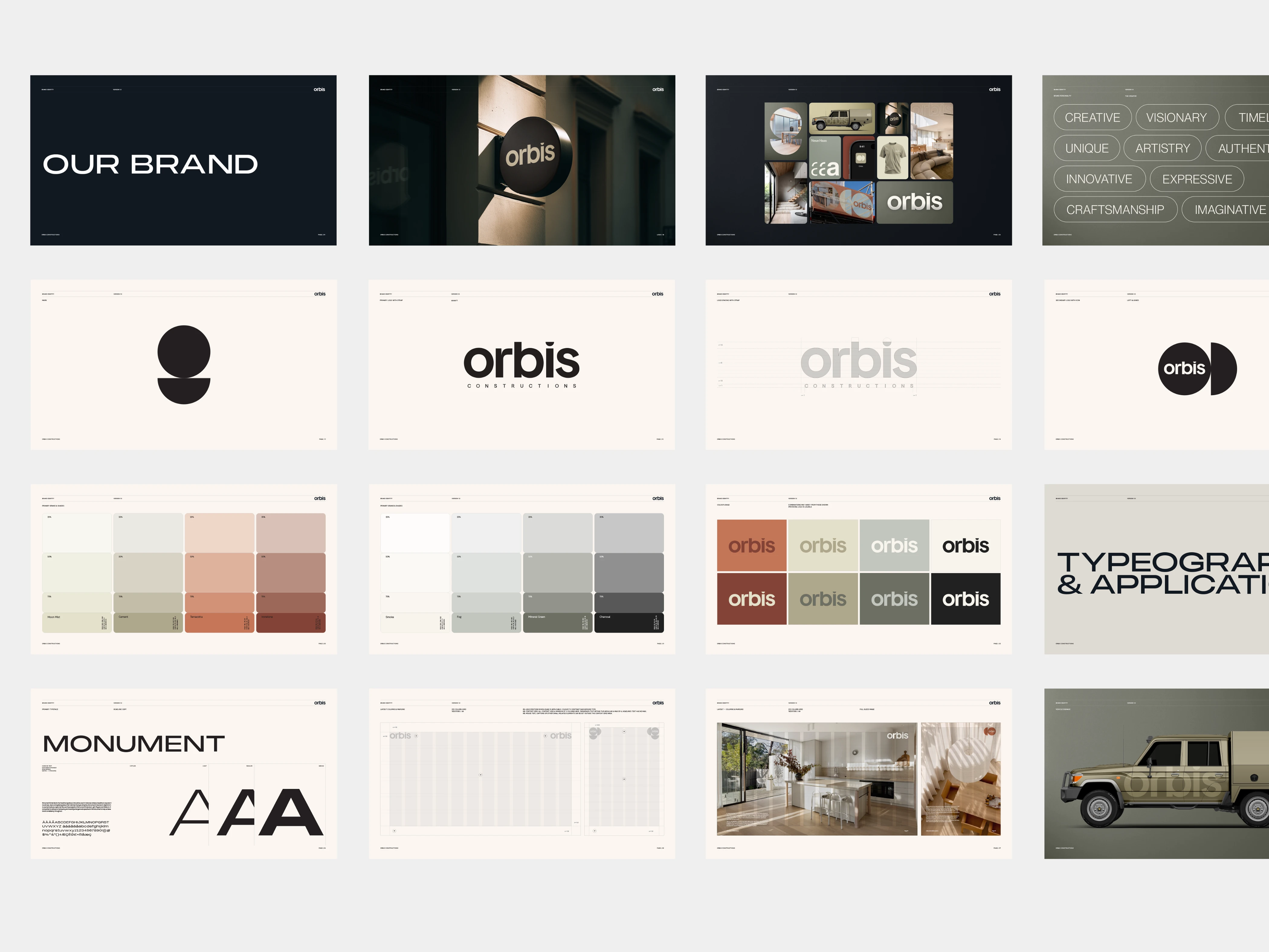
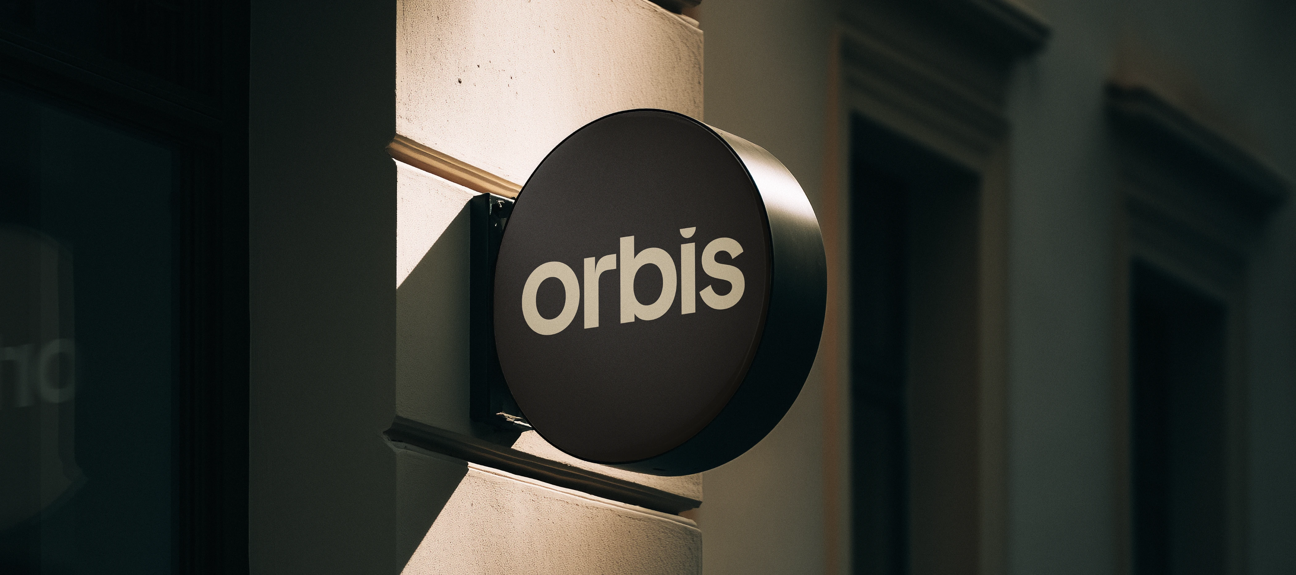
We built a complete identity system around a single geometric idea. A custom wordmark, a circle and half-circle mark, and secondary lockups that flex between horizontal and vertical formats. Those shapes become image masks across every layout, giving documents, hoarding and social content a recognisable frame without leaning on the logo.
Monument Extended brings architectural confidence to headlines, while Neue Haas Grotesk keeps body copy clean and quiet. The rollout covered business cards, letterhead, email signatures, vehicle livery, team apparel and site hoarding designed to work as street-level advertising for every build.
It's all documented in a full set of brand guidelines, so the team can apply it consistently on their own.